
We are ushering in a new season, and it’s time to give your space a colorful makeover! We are using 2020 color trends to help guide you through a seasonal revamp of your home. Whether you want to take this vibrant aesthetic with you throughout the year, or just keep it for the summer, we are here to help.
The Pantone Color Institute released its Colors of the Spring/Summer based on trends seen on the runway during New York and London Fashion Week. These reports inform trends across the spectrum, from clothing manufacturing to interior design. So, these high-fashion patterns, prints, and colors also have room to thrive in your home. Liven up your space to celebrate the season and give yourself a pick-me-up to take you into summer.
What are the Summer 2020 Colors?
London Fashionweek
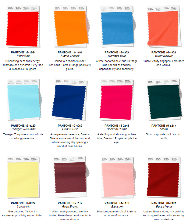
The color palette of London Fashion Week features complex colors that pay homage to the summer season. Warm tones that create the shades of bold neon and sunsets at the end of the day. Shades like Rose Brown and Bossa Nova can provide tonal depth to your space that stays stylish throughout the year. The vibrant warmth they carry will remind you of summer heat waves even after the last autumn leaf has fallen.
New York Fashion Week

The New York Fashion Week color trends bring us back to the shades of an All-American summer and are as bright as the season itself. The assortment of colors reminds us of summer staples like beach balls, denim shorts, grassy fields and bright skies. Bring the vibe of a poolside cabana to your outdoor area (or any space that needs a refresh) with shades like Biscay Green. Or Sunlight, which mimics the illuminating glow of sun beams on a clear summer day.
How Does Color Help a Space?

在你的空间中添加明亮的颜色可以改善你的情绪,增强空间的能量流动。例如,在一个没有接收到很多自然光的房间里添加黄色可以使该区域明亮起来。让夏日般的阳光包围你自己!将蓝色与生产力联系在一起,是家庭办公空间的一个很好的解决方案。
To read more about how color can improve your mood and bright life to your home, read this article.
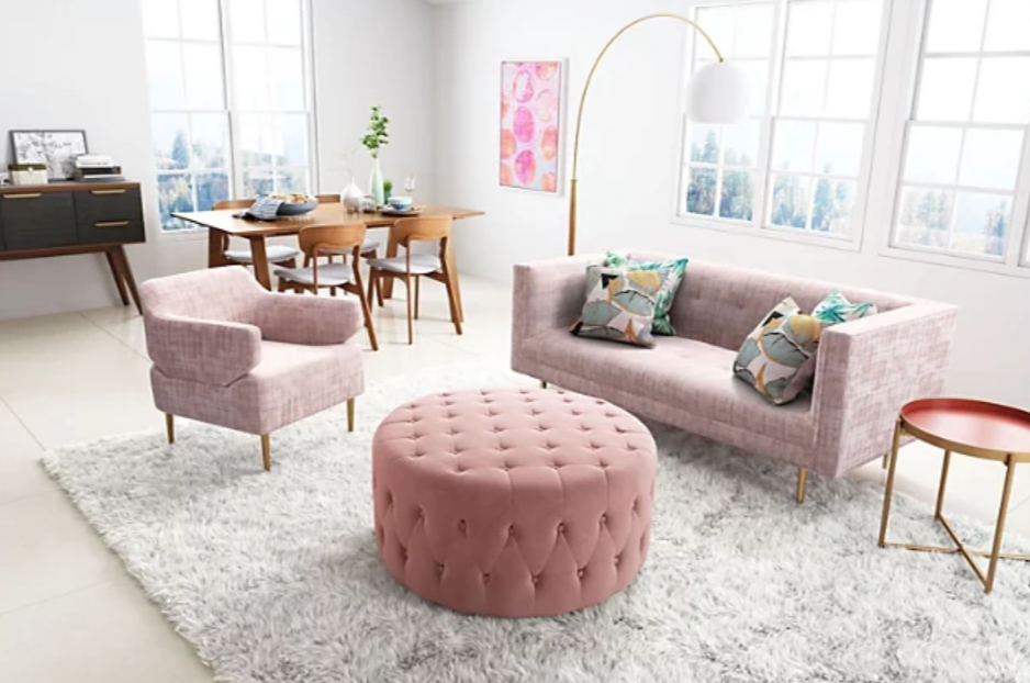
A Vibrant Color Palette
Layering color in your home will create a lively landscape in your space. Although it might seem overwhelming, it can be done with careful placement and proper color selection. The color palettes of the season feature bright pops of colors, and more subdued shades that pair well together.
From the New York selection, balance out the depth of Chive, a rich dark green, with the lighter Faded Denim shade. This combination is perfect if you are trying to achieve a rustic-inspired space with color. Get this look by adding lush, dark greenery to your space. Or pair bright red tones with subtle pinks to create a stark contrast. Color experimentation in your space can lead to an amazing look, so don’t be afraid to try!
A Forever Golden Hour
For all of our warm-toned fans, try to recreate the look of a summer sunset in your space to radiate warmth all year. A golden sunset after a long summer’s day is a culmination of the whole season, a symphony of colors that create the perfect song. Bring those bold warm shades into your space.
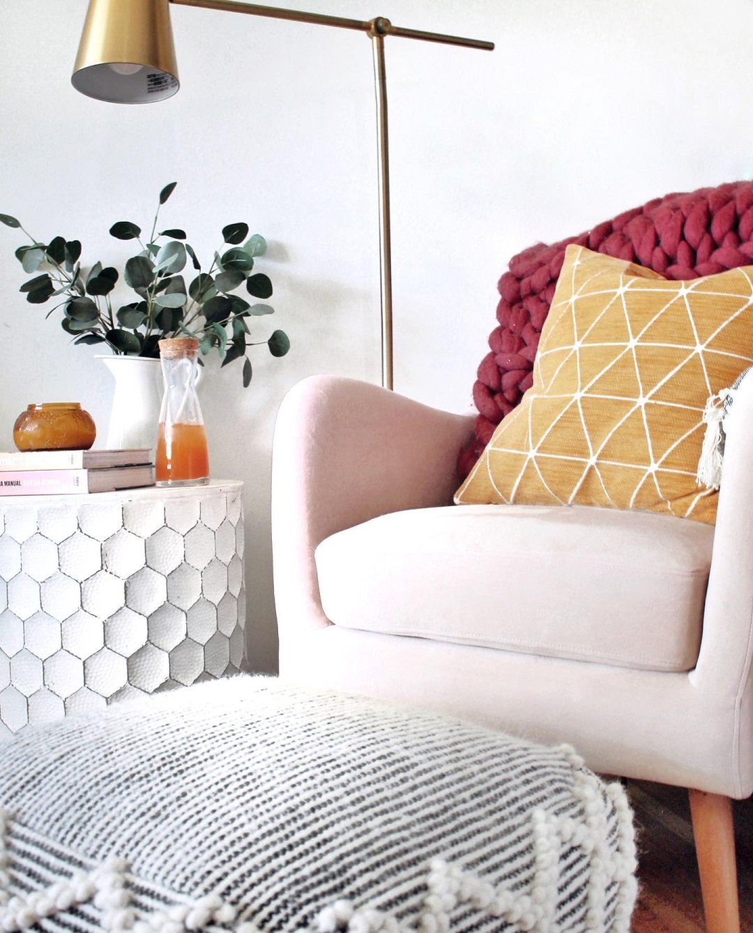
Bright reds like poppy and scarlet are not just great summer-time accents, but can also transition into your autumn decor. For a more subtle look, start with blush-toned pinks like Blossom. Pair with deeper burgundy and wine shades for an abundance of color.
Let’s Get Bright
Fashion trends have brought neon to the forefront of design. Shake up your highlighters and add pops of illuminating color into your space. It’s ok to start out small with a bouquet of flowers, a throw blanket or an accent pillow. Bright colors can help invigorate and energize us throughout the day. And we need all the energy we can get to enjoy every moment of summer. Saffron and Fiery Red are color report shades that help you acclimate yourself to bright colors in your home.
Cool Seaside Shades
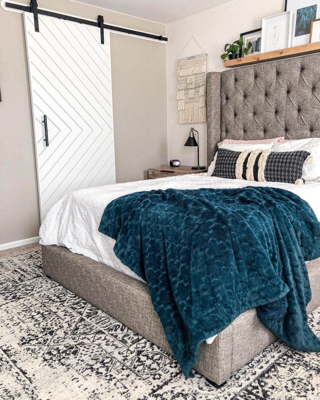
Surf’s up in your space! Bring the serene colors of beach waves and high tide to your home. The 2020 Color of the Year is Classic Blue, a deep shade that promotes calm feelings and productivity. Lighter shades from the trend report, like Faded Denim and Tanger Turquoise, add the color palette of the ocean into your space. Create depth by layering these with deeper shades like Mosaic Blue. Although more subdued than the warm tones of the trend report, the blues are a great way to incorporate color into your space. They transition seamlessly throughout the year and offer a classic pop of color.
The first day of summer is Saturday, June 20th, and we couldn’t think of a better way to celebrate the season than to revamp our home! We want to see your sunshine-filled space and amazing decorating skills. Use #MyAshleyHome on Instagram, and you might even be featured on our feed. For more inspiration to create the perfect space for any time of year, check out our Pinterest boards.


There is a wall color I saw in one of your photos of which I really like. We just purchased seven pieces of the Realyn bedroom collection. The photo with the sleigh bed within that collection has a dark teal color on the wall. How do I find out what that color is?
Thank you,
Jennifer